As it happens, clients get us back again when their homes undergo transitions and changes. We first worked on this home as a new build 13 years ago, and now it was time to extend, by creating a new 'teen wing' with a strong link to a new backyard design.

Named "Teal House" for the client's love of the cool hue, you can see it threaded through almost every space. Part of the success of using colour in this way is altering the shade, saturation and tint throughout.
This project required custom joinery designs and hard finish selections in multiple spaces; seen here - home office, alfresco, multi-purpose laundry and bathrooms. It also required flooring selections, and an update on previous spaces that needed a lift. Although 13 years old, the general colour of walls and carpets were perfectly suitable to keep, linking the existing and new areas in almost indistinguishable fashion.
We worked alongside both pool and landscape professionals to ensure the interior / exterior link was complimentary. A linking area is the alfresco, which was thoughtfully planned to include storage, BBQ, drinks fridge, dishwasher and appropriate surfaces to withstand outdoor elements. See images below for stages of progress from concept, working drawings, to completion.
Alfresco in real life, and sequence below of 3D concept image (LHS) converted to working drawings (RHS)

A fun part of this project was the clients' trust in use of colour and finishes. Something as everyday as a laundry is elevated to become an integral space with not only versatile fixtures and fittings, but with strong colour and interest. We used a strong teal on these barn doors (an unlikely entrance into a multi-purpose laundry/gym space) but they do add a real feature to both the room itself, and the main hallway.
If you look further into this laundry, you'll note use of a cleverly disguised table extendable work surface. Click here to see a clumsy demonstration (by yours truly 😄) of how this genius Hafele mechanism works. It is ideal for so many uses, from folding washing, sewing or craft or even a potting table. It folds away so neatly, you'd never know.
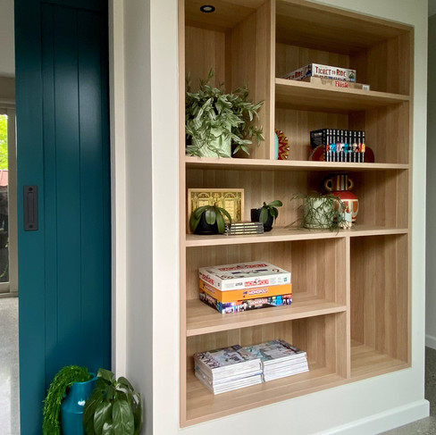
Another example of elevating an ordinary space is the inclusion of built in joinery to the hallway facing outdoors. A handy spot to store everything from board games, to pool towels, the minimal look ensures it always looks contemporary. Having lighting included also creates ambience during evenings spent by the outdoor fire.
Hallway joinery in real life, and sequence of both 3D concept image & working drawings
Decorating this project was just as fun and at times complex to achieve with the lingering effects of Covid on suppliers. Even so, as the clients were really happy to use bold and atmospheric murals, fun lighting and furnishings, installation days were still really exciting! This custom printed mural creates a moody atmosphere in the rumpus area, with highlights of gold; resembling an outer space skyline. All furnishings specified and procured by GDP Interior Design.

Apart from murals, colour bursts and precise custom joinery, lighting was another important way of adding personality into the spaces. For example, this small powder room is given a luxurious feel by way of decorative lighting.
The light is made from perforated metal in Moroccan motif, and scatters dots of light around the room. A perfect evening light for guiding guests to the powder room with a touch of glamour. The study light - resembling crumpled paper, gives a lot of character to the space and a soft glow when other direct overhead task lights are not required.
It's hard to choose a favourite space, because I personally feel so connected to the entire project... however there is something really special about the effect created in this bedroom suite. The furniture, lights and drapery was all existing from the initial project a decade ago, but by changing the feature wall behind the bed, it has created a very unique atmosphere. Called "Grunge", we installed this mural upside down so that the great details would not get lost behind the bedhead! It has a rough "sgraffito" effect which ironically, adds a softness to the space; not unlike a Tuscan villa, with views out onto the garden.

Please pop over to our TEAL HOUSE project page to see the extension in full, including some fabulous outdoor spaces, and further joinery details. Let us know your favourite details; we can answer any product enquires you may have.
Tell us what you think, below. Are you a teal lover?
- GDP
Building credits: Landart (Landscapers) / Striking constructions / Striking pools
Design/decoration/styling: Giulianna del Popolo @GDP
Professional photography: Kate Hansen Photography


Comments